...

10 Web Design Strategies That Can Double Your Sales in Nigeria

web design

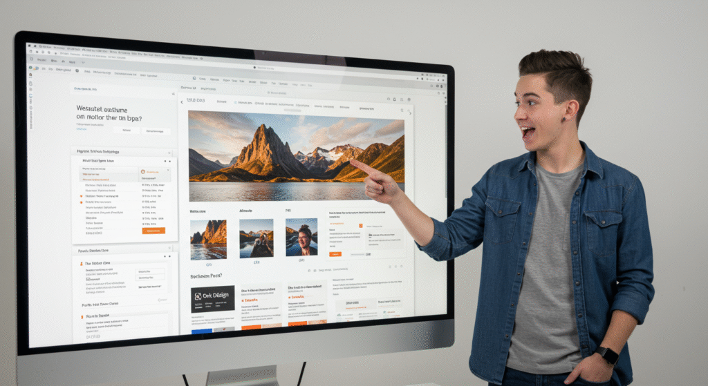
A well-designed website isn’t just about looking fine. It is the foundation of your entire online presence. It decides if your customers will trust you, if they will buy from you, and if they will come back again. In short, good web design can 10x your business growth.

“How to Choose the Right Website for Your Business: 7 Proven Website Types That Get Results”

right website

You don’t just build a website because everyone else has one. You build the right website that works for your specific business model, target audience, and offer.

In this guide, I’ll show you the 7 types of websites that actually drive results and help you choose the one that aligns with your business goals. Not based on trends, not based on guesswork, but based on function, purpose, and profit.

Why Most Business Website Fail – and How to Fix Yours Without Starting Over

We have seen this happen over and over again: a beautiful business website that looks nice but does not actually help the business grow. It does not bring in leads, does not build trust, and does not convert visitors into customers. In 2025, having a business website is not enough. Almost every business, whether in food, fashion, coaching, real estate, or tech, has an online presence But why do so many of them still struggle to grow? The answer? Their website is not doing what it is supposed to do. At Dgazelle Digital Services, we help business owners like you build business websites that do more than just look good. We design sites that work. If you feel like your website is not pulling its weight, this post will show you why, and how to fix it. The Problem: A pretty business websites with no real purpose Let us be honest most people judge a business website by how it looks. And yes, design matters. But design without direction is like building a beautiful store with no entrance. If your homepage is filled with pretty colors but does not explain what you do, who it is for, or how it helps, people will leave confused. We see websites all the time with: These things might seem small, but they make a big difference. If people visit your business websites and do not know what to do next, they will just close the tab. A strong website needs to guide your visitor clearly from the moment they land to the moment they take action. Ready to transform your website into a tool that actually grows your business? Let’s build something strategic together, reach out to Dgazelle today. What It Is Really Costing You When your business website is not working, you are not just losing traffic, you are losing opportunities. You could be missing: No matter what kind of business you run, whether it is skincare, fashion, coaching, real estate, education, or anything else, your website should support your goals. If it is not doing that, it is costing you more than you think. The Fix: How to rescue your business websites The good news is, you do not need to start from scratch. Most times, it is just about making smart changes that bring clarity and direction to your site. Here is how we approach it at Dgazelle: 1. Focus on the problem your customer is facingPeople do not visit your website because they are curious about you. They visit because they have a need. Your site should speak to that need right away. Think about this: when someone lands on your homepage, can they clearly say, “Yes, this is for me”? 2. Make your offer simple and clearAvoid long or clever statements. Instead, use plain words to explain what you do, who it is for, and what they will gain. Example:“We help small business owners create websites that actually bring in sales and make running their business easier.” 3. Clean up your navigationYour menu should not feel like a maze. Keep it simple, with the most important pages easy to find. This makes your site feel welcoming and easy to explore. 4. Design with purposeEverything on your site should lead your visitor somewhere. Use buttons that stand out. Place your most important information near the top. Add testimonials, answers to common questions, or a trust badge, anything that builds confidence. 5. Make it mobile-friendlyMost people will visit your site on their phones. If it is hard to read, slow to load, or awkward to use, they will give up. Make sure your site works well on any device. 6. Be easy to find onlineYour website should show up when people search for what you offer. That means using the right keywords, writing helpful content, and making sure your site loads quickly and runs smoothly. This is what we call SEO, and we build it into every project we take on. Final Thoughts Your website is more than just an online presence, it is part of your team. When it works well, it saves you time, builds trust, and helps grow your business. But if it is not doing any of that, it might be time to make a change. This is what we do at Dgazelle Digital Services. We help business owners turn their websites into something that supports them, not something that drains their energy. If you are ready for a website that is clear, helpful, and built with growth in mind, we would love to help you get there. Let’s build a website that works as hard as you do. Ready to transform your website into a tool that actually grows your business? Let’s build something strategic together, reach out to Dgazelle today.

Proven Smart Website Design in 2025: How to Turn Your Website Visitors into Paying Customers & Raving Fans

Smart Website

In today’s digital world, your website is often your first and most important salesperson. But here’s the thing: a good-looking website alone isn’t enough. If it doesn’t guide visitors toward action, you’re leaving money on the table. This blog shows you how to turn casual clicks into committed customers with smart, SEO-friendly website design in 2025. Whether you run an online store, service business, or personal brand, these tips will help you convert traffic into tangible results. Why Smart Website Design is Crucial in 2025 First impressions happen fast. Studies like this Stanford credibility study reveal that 75% of users judge a company’s credibility based on its website design. In 2025, competition is stiffer than ever, and users are more impatient. A slow, clunky, or confusing site won’t just lose visitors, it’ll lose revenue. At Dgazelle Digital Agency, we believe design is more than pretty visuals. It’s a business tool that guides visitors toward booking a call, purchasing a product, or signing up for a newsletter. Top 6 Design Tactics That Turn Clicks into Conversions Design isn’t just about looking good; it’s about guiding your visitors toward taking action. These six essential tactics focus on usability, clarity, and persuasion to help you turn casual website visitors into loyal customers. By applying these strategies, you’ll create a smoother user experience that boosts your conversion rates and drives business growth. 1. Clear and Consistent Navigation Your menu should be simple, not overwhelming. Users should know where to go without guessing. Limit navigation to 5–7 core items, and make sure your contact or CTA page is always visible. Example: Apple keeps its site navigation minimalist and focused, helping users find exactly what they need. 2. Mobile-First Design With over 60% of traffic now coming from mobile, your site must be thumb-friendly. Use responsive templates, test regularly, and avoid cluttered layouts. Run a quick test with Google’s Mobile-Friendly Test. 3. Speed is Everything If your site takes more than 3 seconds to load, users bounce. Compress images, eliminate unnecessary plugins, and optimize code. Use PageSpeed Insights to monitor performance. 4. Strategic CTAs (Calls-to-Action) Your site should guide visitors step-by-step. Use buttons like: Place CTAs above the fold and at the end of each section. Tip: Make CTAs a contrasting colour so they stand out from the rest of the design. 5. Trust Builders Social proof can boost conversions by up to 34%. Include: 6. SEO-Optimised Content Design and SEO must work hand-in-hand. Use your primary keywords naturally in: For example, if your focus keyword is “mobile-first design,” a well-optimised sentence could be:“Implementing a mobile-first design ensures your website performs perfectly on smartphones and tablets, improving user experience and boosting SEO rankings.” Beyond keywords, make sure your content is clear, useful, and easy to read. Google rewards sites that provide real value to visitors, so combine SEO best practices with great content to maximise your site’s performance. To learn more about combining SEO with smart design, check out Moz’s Beginner’s Guide to SEO. Image Source: Freepik Must-Have Pages for Maximum Conversion Your website isn’t just a digital brochure; it’s a sales engine. However, to convert visitors into leads or customers, certain pages must be present and built with a specific purpose. These core pages not only inform but also guide users through your sales funnel seamlessly. Whether you’re launching a new website or optimizing an existing one, start by getting these essentials right. Avoid These Common Mistakes Even with the best intentions, many websites lose potential customers due to simple design oversights. These mistakes can create friction in the user experience, reduce trust, and prevent conversions. By identifying and avoiding them early, you’ll make a smoother, more engaging site that delivers better results. Here are some common pitfalls to steer clear of: Enhance Engagement with Visual Hierarchy Visual hierarchy is the art of guiding your visitors’ eyes toward the most important elements on each page. By strategically placing headings, images, buttons, and whitespace, you can increase user engagement and improve conversions. Tip: Use larger fonts and bold colours for key messages, and keep secondary information less prominent. Check out Canva’s guide to visual hierarchy to better structure your layout. Integrate Live Chat and Chatbots Customer support no longer happens only through email. Live chat or AI-powered bots can answer questions instantly, remove buying hesitations, and boost trust. Tools like Tidio or LiveChat are easy to install and mobile-friendly. Want Your Website to Convert Better in 2025? Smart website design is no longer optional; it’s essential. To turn your traffic into sales, you need a conversion-driven approach. At Dgazelle Digital Agency, we don’t just design. We build websites that sell. 👉 Book a Free Website Audit and find out how to make your site work harder for your business.

What Is Bounce Rate and How to Improve Yours

When it comes to understanding how your website is performing, bounce rate is one of the most telling metrics, but it’s also one of the most misunderstood. Simply put, bounce rate tracks the percentage of people who land on your website and leave without clicking on anything, filling a form, or spending more than a few seconds. In essence, it measures how many visitors didn’t engage with your site. Now, if you’re running a business in Nigeria whether it’s a service, e-commerce, or consulting brand, this matters. A high bounce rate might mean your website isn’t doing its job in keeping visitors interested or guiding them toward taking action. That’s a missed opportunity. A bounce happens when someone lands on a page, doesn’t scroll, click, or interact, and then leaves. It’s not the same as exit rate, which tracks when people leave a specific page but after possibly visiting others. Bounce rate gives deeper insight into your site’s initial impression and content effectiveness. And if you’re wondering how to create a site that keeps people exploring, well that’s where Dgazelle comes in. But more on that later. How Is Bounce Rate Calculated? Bounce rate is calculated by dividing the number of visitors who didn’t engage with your website by the total number of visitors during a specific period. For example, if 1,000 people visited your site in a month and 400 left without clicking or scrolling, your bounce rate would be 40%. Here’s the simple formula:Bounce Rate = (Unengaged Sessions / Total Sessions) × 100 For Nigerian business owners, this is more than just numbers. A high bounce rate might mean your homepage isn’t doing enough to pull people in or your site structure isn’t guiding visitors well. If that’s the case, your site could use a strategic upgrade—something we help businesses achieve every day at Dgazelle. What’s a “Normal” Bounce Rate? First off, let’s be clear—bounce rates aren’t one-size-fits-all. Different websites and even different pages within the same site will naturally have varying bounce rates. For instance, a contact page with just a phone number or address may have a high bounce rate—and that’s perfectly normal. The visitor came, got what they needed, and left. Similarly, blog articles tend to have higher bounce rates because people often skim, get value, and exit. That doesn’t always mean something is wrong. According to CXL’s data: Industry plays a role too—real estate sites average around 44.5%, while food and drink sites can hit up to 65.5%. For this data to make sense, you need to think about how these websites are used.  Real estate websites have a much lower bounce rate because website visitors are likely browsing multiple properties before leaving the site. Restaurant websites offer quick bits of information, like location, hours, or menus, and don’t require as much clicking around or engaging with the content. CXL also discovered that bounce rate can differ based on the channel through which a website visitor landed on your site. For example, someone who found your site organically through search doesn’t have as high of a bounce rate as someone who landed on your site from a social media link. How to Improve Your Bounce Rate A high bounce rate is often a red flag that visitors aren’t connecting with your site. To reduce it, your website needs to be fast, easy to navigate, and offer value quickly. Here’s how to keep your audience engaged especially in a digital landscape like Nigeria, where attention spans are short and data is precious. 1. Speed Up Your Page Load TimeIn Nigeria, where internet speeds can vary widely, a slow-loading website is an engagement killer. If your site takes more than a few seconds to load, visitors are likely to bounce before it even finishes. Start by optimizing performance: 2. Optimize for Mobile UsersIn Nigeria, over 80% of internet access happens via mobile phones. If your website isn’t mobile-friendly, you’re losing potential customers by the minute. A mobile-optimized site isn’t a luxury, it’s a necessity. Here’s how to do it right: 3. Satisfy Search IntentThink about what your visitors are really looking for. If someone lands on your site through Google, but the content doesn’t match their needs, they’ll leave immediately hurting your bounce rate. For example, if your page promises “affordable property in Abuja” but only lists generic real estate tips, you’ve missed the mark. Every page on your website should clearly answer a question or fulfill a purpose. At Dgazelle, we help you plan your website content around real user intent so your audience finds what they’re searching for, stays longer, and trusts your brand more. 4. Focus on What’s “Above the Fold”Your website’s first impression is everything. What a visitor sees before they scroll, known as “above the fold” can either hook them or send them bouncing off. Nigerian audiences are quick to judge a site’s value, especially on mobile. To keep them engaged: The goal is to show your value immediately by designing high-converting hero sections that grab attention and guide users deeper into your site content right from the first glance. 5. Make Your Content Easy to DigestNobody wants to read endless text. If your site feels like a textbook, users won’t stick around. Nigerian users, especially those browsing on mobile, prefer skimmable, clean, and engaging layouts. Make your pages more reader-friendly with: We help brands turn boring layouts into dynamic, easy-to-navigate content experiences that hold attention and boost engagement, keeping bounce rates low and conversion rates high. Let’s chat 8. Add a Table of Contents Placing a table of contents at the top of each blog post immediately lets visitors know what they can learn by reading or make it easier for them to find the exact section they’re looking for. Plus, making your blog contents interactive helps to lower your bounce rate by letting readers click around to read the sections that interest them most. 9. Include a Call-to-Action Include buttons that lead users to take a desired action.

Hidden User Behavior: How Heatmapping Reveals What Your Visitors Aren’t Telling You

Ever wondered why some visitors leave your website without taking action? Heatmaps help you track audience behavior, showing where users click, how far they scroll, and what grabs their attention. This data helps you optimize your site’s layout, reduce friction, and make CTAs more effective. A website heatmap visually represents user interactions using color-coded data. Warm colors (red, orange, yellow) highlight areas that get the most engagement, while cool colors (blue, green) show less popular spots. Heatmaps track: Marketers and business owners use heatmaps to enhance user experience (UX), fix engagement gaps, and boost conversions. For example, a well-placed CTA informed by heatmap insights can significantly improve your sales and lead generation. Types of Website Heatmaps Not all website visitors behave the way you expect. Some never scroll past the first section, while others click on elements that aren’t even clickable. Heatmaps uncover these hidden user behaviors, helping you optimize your website for better engagement and conversions. Below are the most valuable types of heatmaps and how they can improve your site’s performance: 1. Movement Maps (Hover Maps): Movement maps track where users move their mouse when navigating your website. This data often correlates with where they are looking, revealing areas of interest. If users’ cursors hover over certain sections for extended periods, they may be paying attention to those areas. 2. Click Maps: Click maps show where visitors click on a webpage, using warm colors to indicate popular areas and cool colors for areas with little to no interaction. If users are clicking on non-clickable elements, it signals confusion and potential UI/UX issues. 3. Scroll Maps: Scroll maps track how far users scroll down a page, helping you understand whether visitors see your most important content. Warmer colors indicate sections with higher visibility, while cooler areas show where visitors drop off. 4. Eye-Tracking Maps: Unlike movement maps, which track mouse movements, eye-tracking heatmaps measure where users’ eyes focus on a page. They provide insight into what catches users’ attention the most. 5. Engagement Zone Maps: Engagement zone maps combine multiple data points, including clicks, scrolls, and movement, into a single visual representation. They highlight areas of high engagement, helping you refine page layout and content strategy. 6. Rage Click Maps: Rage click maps highlight areas where users repeatedly click in frustration. This often signals broken links, slow-loading pages, or confusing design elements. 7. Mobile vs. Desktop Heatmaps: With Nigeria’s growing mobile-first audience, device-specific heatmaps are essential. They show how user behavior differs between desktop and mobile, helping you optimize accordingly. Need expert help optimizing your website for better conversions? Dgazelle can transform your site into a high-performing sales engine. Let’s talk! How Can You Use Heatmaps for Digital Marketing? Heatmaps provide deeper insights into user behavior than standard analytics tools. Instead of just knowing that a page has a high bounce rate, heatmaps explain why—showing whether users aren’t scrolling far enough, missing key CTAs, or getting distracted by unimportant elements. This qualitative data helps businesses refine their website strategy, improve conversions, and deliver better user experiences. Here’s how you can use heatmaps to elevate your digital marketing efforts: 1. Run Cross-Device Analysis Visitors interact differently depending on whether they’re using a smartphone, tablet, or desktop. Mobile users tend to scroll further, while desktop users focus more on above-the-fold content. If your website isn’t optimized for these behaviors, you could be losing potential customers. How to Use This Insight: Optimize CTA Placement – If mobile users scroll more, position key CTAs further down the page. If desktop users engage less with scrolling, place them higher.Ensure Mobile-Friendly Layouts – If mobile users struggle to engage, optimize spacing, font sizes, and button placements.Adjust Image & Content Positioning – Keep critical information in high-visibility areas based on engagement patterns. 2. Improve CTA Conversion Rates Every business wants more clicks on their Call-to-Action (CTA) buttons, but not all CTAs get attention. Heatmaps show where users are actually clicking, helping you refine button placement, size, and design for higher engagement. How to Use This Insight: Identify Click Patterns – If users are clicking elsewhere instead of your CTA, reposition it in a high-engagement area.Eliminate Distractions – Remove elements that compete for attention, such as unnecessary links or images.Test CTA Design & Wording – Experiment with different colors, sizes, and text to find the best-performing version. Example: A click map reveals that users expect a text headline to be clickable instead of the CTA button below it. Making the headline clickable improves engagement. 3. Review Page-Specific Performance Not all pages need heatmaps—focus on high-impact pages that directly affect your business goals. Where to Use Heatmaps Effectively: How to Use This Insight: Track Engagement on Key Sections – Identify where users drop off and tweak content placement.Find the Best CTA Spot – If users scroll past the CTA without clicking, reposition it for better visibility.Refine Content Layout – Move the most important details higher on the page for quicker access. Example: A heatmap on a high-traffic blog post shows that users stop reading halfway. Adding an engaging subheading or CTA in that section encourages them to keep scrolling. 4. Optimize Page Layout to Reduce Bounce Rate A well-structured page keeps visitors engaged. If heatmaps reveal that users aren’t scrolling far enough or aren’t clicking important elements, it’s time for a redesign. How to Use This Insight: Move Essential Elements Higher – Ensure CTAs, product highlights, or lead forms appear in high-traffic areas.Remove Unnecessary Distractions – If users repeatedly click on non-clickable images, replace them with actionable elements.Adjust Content Order – If visitors don’t reach key sections, reposition them to appear earlier in the layout. Example: A scroll map shows that only 20% of visitors reach the pricing section. Moving it closer to the top increases conversions. Unlock the secrets of user behavior—use heatmaps to refine your website and drive more conversions! Heatmap Tool Options: Finding the Right Fit To track and analyze visitor behavior effectively, you’ll need a heatmap or behavioral analytics tool. These tools help

Orphan Pages Killing Your SEO? Here’s How to Find and Fix Them

When we talk about orphan pages, we’re referring to web pages that exist on your site but aren’t linked to from any other page. This means users and search engines have a hard time finding them. For Nigerian SME owners, this is crucial because if potential customers can’t discover your best content, you’re missing out on sales and visibility. Orphan pages aren’t necessarily bad for SEO, but they don’t contribute to your site’s overall content strategy. You could have top-notch content on these pages, but without internal links guiding users and search engines to them, they serve little purpose. Sometimes, orphan pages are created intentionally—like landing pages used in paid ads. These pages are usually set up to be hidden from search engines with tags like “noindex, nofollow,” which is perfectly fine. But for your main website, every valuable page should be easy to find and accessible to users and search engines. What Exactly Are Orphan Pages? Orphan pages are web pages on your site that have no internal links pointing to them from any other page—be it your homepage, blog posts, category pages, or navigation menu. This means users and search engines can’t easily discover them. But it goes beyond that. If a page is only linked from other orphan pages, it’s still considered an orphan. For example, if Blog Posts B and C are linked only from Post A, and Post A itself is orphaned, then B and C are also orphans. They’re isolated from the main site structure, making them invisible to search engines and users navigating from your homepage. For Nigerian SMEs, this can be a big problem. Hidden pages mean missed business opportunities, as potential customers won’t find your valuable content or products. When Is It Okay to Have Orphan Pages? Not all orphan pages are bad. In fact, some are intentional. These include: These pages are usually hidden from search engines with “noindex, nofollow” tags and don’t need to be part of your main site structure. As long as this is strategic and intentional, it’s perfectly fine. What Causes Orphan Pages? Orphan pages often occur unintentionally, but they can also be deliberate.Common Causes Include: Intentional Orphan Pages:Some orphan pages are purposefully isolated, like: As long as these are strategic, they’re okay. Just make sure they’re excluded from search engine indexing. Why Are Orphan Pages Bad for SEO? Google and other search engines discover new content by following internal links. If a page is orphaned, search engines won’t find it unless it’s in your sitemap or has backlinks. No Internal Links = No PageRankPageRank is Google’s way of understanding a page’s importance based on the number and quality of links pointing to it. Without internal links, an orphan page can’t receive any “link juice” or PageRank, impacting its SEO performance. For Nigerian SMEs, this means valuable content or product pages could be hidden from potential customers, ultimately affecting your bottom line. How to Find Orphan Pages on Your Website Finding orphan pages requires a thorough approach using multiple tools and methods. Here’s how to get it done: 1. Using SEO Crawling Tools These tools can identify orphan pages even if they’re not linked internally by comparing the site’s crawl data with your sitemap. Combining these tools provides a comprehensive view of orphan pages on your site. 2. Using GA4 and Search Console This approach also helps discover low-performing pages for future content improvement. 3. Manual Site Audit This is the most accurate but time-consuming method. Hiring a dedicated SEO Agency to help keep on top of things like this could also save you time. The experience they have will mean they are always looking out not just for issues with orphan pages, but hundreds of other things that could also be impacting your organic visibility. 4. Backlink Analysis Tools to Use: How to Fix Orphan Pages on Your Website Once you’ve identified the orphan pages, fixing them is straightforward. Here are two effective methods: 1. Adding Internal Links If the orphan page is valuable and relevant: 2. Remove and Redirect If the orphan page is outdated or no longer relevant: Why It Matters: A 301 redirect preserves link equity and ensures users land on a relevant page, maintaining a positive user experience. Conclusion All content on your website should have a purpose for both users and SEO. If a page is orphaned it becomes arguably useless for them both. If you have any other methods you use for finding orphan pages, we’d love to hear them. Boost your online presence and grow your business with Dgazelle’s expert social media and digital marketing services. From creative strategies to tailored campaigns, we’ve got you covered.

Seraphinite AcceleratorOptimized by Seraphinite Accelerator
Turns on site high speed to be attractive for people and search engines.